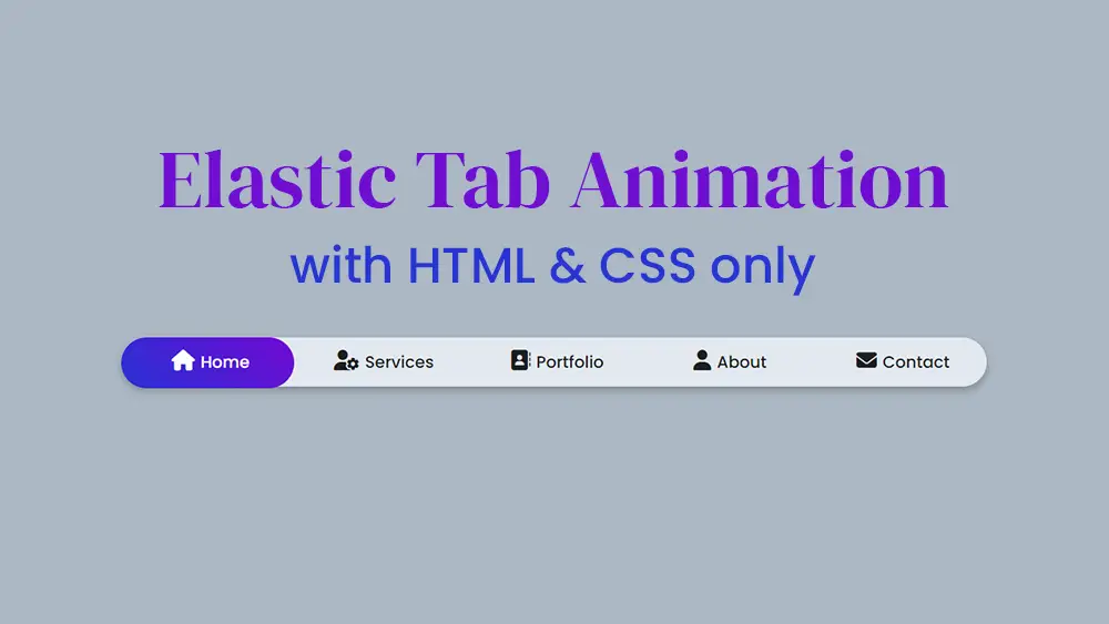
In today’s blog, you’ll discover how to create an Elastic Active Tab Animation using only HTML and CSS. Previously, I shared a tutorial on how to create an Active Tab Hover Animation with HTML and CSS, which is similar in concept but simpler. This new design is more advanced and attractive, featuring a dynamic elastic animation for active tabs.
Menu bars are crucial for guiding visitors to important pages on your website, and tabs are ideal for single-page applications or showcasing various topics in a compact space. This tutorial will teach you how to create an Elastic Tab Animation using only HTML and CSS, adding a sophisticated touch to your web designs without the need for JavaScript.
In this example, we have a menu bar on the webpage with five different menu icons and text labels. When a menu item is clicked, an elastic tab animation with a gradient background color is triggered. While similar animations often rely on JavaScript or JavaScript libraries, this tutorial demonstrates how to achieve the same effect using pure CSS, showcasing the power and versatility of CSS in web development.
Video Tutorial
If you’re having trouble understanding the explanation, you can watch a complete video tutorial on creating the Elastic Tab Animation.
In the video, you’ve observed how to create an elastic active tab animation using only HTML and CSS. I hope you’ve grasped the fundamental code required for this animation. This is a straightforward CSS project, so if you’re a beginner in web design with basic knowledge of HTML and CSS, you’ll find the code easy to understand.
To create the Elastic Tab Animation, start by making two files: an HTML file and a CSS file. Once you’ve created these files, simply paste the following code into each respective file.
HTML
First, create an HTML file with the name of index.html and paste the given codes in your HTML file. Remember, you’ve to create a file with .html extension.
This HTML code sets up the structure for an elastic tab animation using HTML and CSS. It starts with the standard HTML5 document declaration and includes metadata such as character encoding and title. The head section links to an external CSS file (style.css) for styling and Font Awesome for icons. The body contains a div with a wrapper class, which includes a nav element. Within the nav, five radio inputs represent the tabs, each with a unique id and a common name attribute, ensuring only one can be selected at a time. The first tab is pre-selected. Labels associated with these radio inputs contain icons and text, and a div with the class tab is used for the animation effect.
The CSS linked in style.css will handle the visual styling and animation, making the selected tab appear elastic and animated. This structure uses pure HTML and CSS, with no JavaScript, to create a visually appealing and interactive tab menu. The Font Awesome icons enhance the user interface, providing a professional look to the tab labels.
					<!DOCTYPE html>
<!-- Created By Mr. Geek | www.wphotshot.com -->
<html lang="en" dir="ltr">

<head>
   <meta charset="utf-8">
   <title>Elastic Tab Animation | WPHotShot</title>
   <link rel="stylesheet" href="style.css">
   <link rel="stylesheet" href="https://cdnjs.cloudflare.com/ajax/libs/font-awesome/6.5.2/css/all.min.css" />
</head>

<body>
   <div class="wrapper">
      <nav>
         <input type="radio" name="tab" id="home" checked>
         <input type="radio" name="tab" id="inbox">
         <input type="radio" name="tab" id="contact">
         <input type="radio" name="tab" id="heart">
         <input type="radio" name="tab" id="about">
         <label for="home" class="home"><a href="#"><i class="fas fa-home"></i>Home</a></label>
         <label for="inbox" class="inbox"><a href="#"><i class="fa-solid fa-user-gear"></i>Services</a></label>
         <label for="contact" class="contact"><a href="#"><i class="fa-solid fa-address-book"></i>Portfolio</a></label>
         <label for="heart" class="heart"><a href="#"><i class="fa-solid fa-user"></i>About</a></label>
         <label for="about" class="about"><a href="#"><i class="fa-solid fa-envelope"></i>Contact</a></label>
         <div class="tab"></div>
      </nav>
   </div>
</body>

</html>
CSS
Second, create a CSS file with the name of style.css and paste the given codes in your CSS file. Remember, you’ve to create a file with .css extension.
					@import url('https://fonts.googleapis.com/css?family=Poppins:400,500,600,700&display=swap');
*{
  margin: 0;
  padding: 0;
  box-sizing: border-box;
  font-family: 'Poppins', sans-serif;
}
html,body{
  display: grid;
  height: 100%;
  place-items: center;
  text-align: center;
  background: #abb8c3;
}
.wrapper{
  height: 60px;
  width: 55vw;
  background: #E2E8F0;
  line-height: 60px;
  border-radius: 50px;
  box-shadow: 0 5px 10px rgba(0,0,0,0.25);
}
.wrapper nav{
  position: relative;
  display: flex;
}
.wrapper nav label{
  flex: 1;
  width: 100%;
  z-index: 1;
  cursor: pointer;
}
.wrapper nav label a{
  position: relative;
  z-index: -1;
  color: #1d1f20;
  font-size: 20px;
  font-weight: 500;
  text-decoration: none;
  transition: color 0.6s ease;
}
.wrapper nav #home:checked ~ label.home a,
.wrapper nav #inbox:checked ~ label.inbox a,
.wrapper nav #contact:checked ~ label.contact a,
.wrapper nav #heart:checked ~ label.heart a,
.wrapper nav #about:checked ~ label.about a{
  color: #fff;
}
.wrapper nav label a i{
  font-size: 25px;
  margin: 0 7px;
}
.wrapper nav .tab{
  position: absolute;
  height: 100%;
  width: 20%;
  left: 0;
  bottom: 0;
  z-index: 0;
  border-radius: 50px;
  background: linear-gradient(45deg, #2832D4 0%,#7209D4 100%);
  transition: 0.6s cubic-bezier(0.68, -0.55, 0.265, 1.55);
}
.wrapper nav #inbox:checked ~ .tab{
  left: 20%;
}
.wrapper nav #contact:checked ~ .tab{
  left: 40%;
}
.wrapper nav #heart:checked ~ .tab{
  left: 60%;
}
.wrapper nav #about:checked ~ .tab{
  left: 80%;
}
.wrapper nav input{
  display: none;
}
Demo:
Conclusion
In this tutorial, you’ve learned how to create an engaging elastic active tab animation using only HTML and CSS. This technique enhances the user interface with a visually appealing and interactive element, making your website more dynamic and user-friendly. By utilizing CSS transitions and pseudo-elements, you can achieve smooth, stretchy animations that respond to user interactions without the need for complex JavaScript. Implementing such animations not only improves the aesthetic appeal of your site but also keeps users engaged. Experiment with different styles and transitions to further customize the effect and make your web design stand out. Happy coding!


