Have you ever seen those cool flipping cards on websites? They’re an engaging way to present information, and you can create them using just HTML & CSS.
A card is a square or rectangular portion that offers important information about a specific subject. Cards come in a variety of shapes and sizes, including profile cards, product cards, and so on.
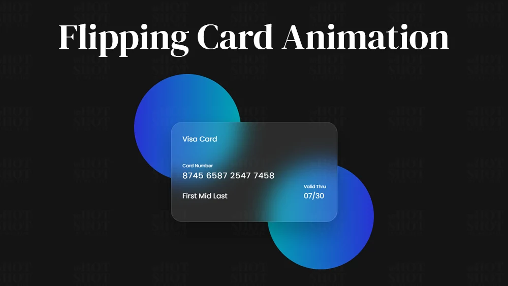
Take a look at the given image of our project. As you can see there are two beautiful gradients balls and between them, there is a card with glassmorphism UI. In the card, there is a Visa card logo, chip, and some card owner details like card number, name, and the valid date of the card. The interesting part of this project is when you hover over the card it will flip and the back side of the card visible. On the back side of that card, I have added some other information as well.
In this guide, we’ll show you how to make your own flipping card animation step by step.
Step 1: Setting Up the HTML
div element with the class name container as the container for our card, and two more div elements for the front and back faces of the card.
					<!DOCTYPE html>
<!-- Coding By WpHotShot - www.wphotshot.com -->
<html lang="en">
  <head>
    <meta charset="UTF-8" />
    <meta http-equiv="X-UA-Compatible" content="IE=edge" />
    <meta name="viewport" content="width=device-width, initial-scale=1.0" />
    <title>Flipping Card UI Design | WpHotShot</title>
    <link rel="stylesheet" href="style.css" />
  </head>
  <body>
    <section>
      <div class="container">
        <div class="card front-face">
          <header>
            <span class="logo">
              <!--<img decoding="async" src="images/logo.png" alt="" />-->
              <h5>Visa Card</h5>
            </span>
           <!--<img decoding="async" src="images/chip.png" alt="" class="chip" />-->
          </header>

          <div class="card-details">
            <div class="name-number">
              <h6>Card Number</h6>
              <h5 class="number">8745 6587 2547 7458</h5>
              <h5 class="name">First Mid Last</h5>
            </div>

            <div class="valid-date">
              <h6>Valid Thru</h6>
              <h5>07/30</h5>
            </div>
          </div>
        </div>

        <div class="card back-face">
          <h6>
            For customer service call +977 999 9999 or email at
            visacard@email.com
          </h6>
          <span class="magnetic-strip"></span>
          <div class="signature"><i>574</i></div>
          <h5>
            Lorem ipsum dolor sit amet, consectetur adipisicing elit. Officia
            maiores sed doloremque nesciunt neque beatae voluptatibus doloribus.
            Libero et quis magni magnam nihil temporibus? Facere consectetur
            dolore reiciendis et veniam.
          </h5>
        </div>
      </div>
    </section>
  </body>
</html>
Step 2: Styling the Card with CSS
Next, we need to style our card with CSS.
					/* Import Google Font - Poppins */
@import url("https://fonts.googleapis.com/css2?family=Poppins:wght@300;400;500;600&display=swap");

* {
  margin: 0;
  padding: 0;
  box-sizing: border-box;
  font-family: "Poppins", sans-serif;
}
section {
  position: relative;
  min-height: 100vh;
  width: 100%;
  background: #141414;
  display: flex;
  align-items: center;
  justify-content: center;
  color: #fff;
  perspective: 1000px;
}
section::before {
  content: "";
  position: absolute;
  height: 240px;
  width: 240px;
  border-radius: 50%;
  transform: translate(-150px, -100px);
  background: linear-gradient(90deg, #2832d4, #00a5b2);
}
section::after {
  content: "";
  position: absolute;
  height: 240px;
  width: 240px;
  border-radius: 50%;
  transform: translate(150px, 100px);
  background: linear-gradient(90deg, #00a5b2, #2832d4);
}
.container {
  position: relative;
  height: 225px;
  width: 375px;
  z-index: 100;
  transition: 0.6s;
  transform-style: preserve-3d;
}
.container:hover {
  transform: rotateY(180deg);
}
.container .card {
  position: absolute;
  height: 100%;
  width: 100%;
  padding: 25px;
  border-radius: 25px;
  backdrop-filter: blur(25px);
  background: rgba(255, 255, 255, 0.1);
  box-shadow: 0 25px 45px rgba(0, 0, 0, 0.25);
  border: 1px solid rgba(255, 255, 255, 0.1);
  backface-visibility: hidden;
}
.front-face header,
.front-face .logo {
  display: flex;
  align-items: center;
}
.front-face header {
  justify-content: space-between;
}
.front-face .logo img {
  width: 48px;
  margin-right: 10px;
}
h5 {
  font-size: 16px;
  font-weight: 400;
}
.front-face .chip {
  width: 50px;
}
.front-face .card-details {
  display: flex;
  margin-top: 40px;
  align-items: flex-end;
  justify-content: space-between;
}
h6 {
  font-size: 10px;
  font-weight: 400;
}
h5.number {
  font-size: 18px;
  letter-spacing: 1px;
}
h5.name {
  margin-top: 20px;
}
.card.back-face {
  border: none;
  padding: 15px 25px 25px 25px;
  transform: rotateY(180deg);
}
.card.back-face h6 {
  font-size: 8px;
}
.card.back-face .magnetic-strip {
  position: absolute;
  top: 40px;
  left: 0;
  height: 45px;
  width: 100%;
  background: #000;
}
.card.back-face .signature {
  display: flex;
  justify-content: flex-end;
  align-items: center;
  margin-top: 80px;
  height: 40px;
  width: 85%;
  border-radius: 6px;
  background: repeating-linear-gradient(
    #fff,
    #fff 3px,
    #efefef 0px,
    #efefef 9px
  );
}
.signature i {
  color: #000;
  font-size: 12px;
  padding: 4px 6px;
  border-radius: 4px;
  background-color: #fff;
  margin-right: -30px;
  z-index: -1;
}
.card.back-face h5 {
  font-size: 8px;
  margin-top: 15px;
}
Conclusion
Flipping card animations are a fun and engaging way to present information on a website. By using HTML, CSS, and JavaScript, we can create our own flipping card animation from scratch, customize it to our liking, and add it to our website or portfolio.
So go ahead and try creating your own flipping card animation today. Who knows, it might just be the perfect way to showcase your skills, products, or services and impress your visitors.

