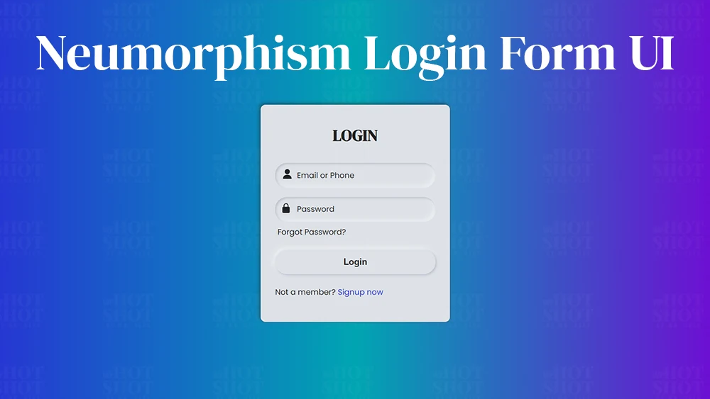
Neumorphism is a design trend that has been gaining popularity in recent years. It is a combination of skeuomorphism and flat design, and it creates a sense of depth and realism by using light and shadow effects. Neumorphism can be used to create a variety of UI elements, including login forms.
In this tutorial, we will show you how to create a neumorphic login form using HTML and CSS. We will start by creating the basic structure of the form, and then we will add the neumorphic effects.
Step 1: Create the HTML Markup
The first step is to create the basic structure of the form. We will use the following HTML code:
					<!DOCTYPE html>
<!-- By Mr. Geek - www.wphotshot.com -->
<html lang="en">

<head>
  <meta charset="UTF-8" />
  <meta http-equiv="X-UA-Compatible" content="IE=edge" />
  <meta name="viewport" content="width=device-width, initial-scale=1.0" />
  <title>Login Form | WPHotshot</title>
  <link rel="stylesheet" href="style.css" />
  <script src="main.js" defer></script>
  <!-- Fontawesome CDN Link -->
  <link rel="stylesheet" href="https://cdnjs.cloudflare.com/ajax/libs/font-awesome/6.2.1/css/all.min.css" />
</head>

<body>
  <div class="content">
    <div class="text">
       LOGIN
    </div>
    <form action="#">
       <div class="field">
          <input required="" type="text" class="input">
          <span class="span"><svg class="" xml:space="preserve" style="enable-background:new 0 0 512 512" viewBox="0 0 512 512" y="0" x="0" height="20" width="50" xmlns:xlink="http://www.w3.org/1999/xlink" version="1.1" xmlns="http://www.w3.org/2000/svg"><g><path class="" data-original="#000000" fill="#212121" d="M256 0c-74.439 0-135 60.561-135 135s60.561 135 135 135 135-60.561 135-135S330.439 0 256 0zM423.966 358.195C387.006 320.667 338.009 300 286 300h-60c-52.008 0-101.006 20.667-137.966 58.195C51.255 395.539 31 444.833 31 497c0 8.284 6.716 15 15 15h420c8.284 0 15-6.716 15-15 0-52.167-20.255-101.461-57.034-138.805z"></path></g></svg></span>
          <label class="label">Email or Phone</label>
       </div>
       <div class="field">
          <input required="" type="password" class="input">
          <span class="span"><svg class="" xml:space="preserve" style="enable-background:new 0 0 512 512" viewBox="0 0 512 512" y="0" x="0" height="20" width="50" xmlns:xlink="http://www.w3.org/1999/xlink" version="1.1" xmlns="http://www.w3.org/2000/svg"><g><path class="" data-original="#000000" fill="#212121" d="M336 192h-16v-64C320 57.406 262.594 0 192 0S64 57.406 64 128v64H48c-26.453 0-48 21.523-48 48v224c0 26.477 21.547 48 48 48h288c26.453 0 48-21.523 48-48V240c0-26.477-21.547-48-48-48zm-229.332-64c0-47.063 38.27-85.332 85.332-85.332s85.332 38.27 85.332 85.332v64H106.668zm0 0"></path></g></svg></span>
          <label class="label">Password</label>
       </div>
       <div class="forgot-pass">
          <a href="#">Forgot Password?</a>
       </div>
       <button class="button">Login</button>
       <div class="sign-up">
          Not a member?
          <a href="#">Signup now</a>
       </div>
    </form>
 </div>

</html>
This code creates a simple login form with two input fields and a submit button.
Step 2: Add CSS Styling
Now that we have the basic structure of the form, we can add the neumorphic effects. We will use the following CSS code:
					/* Import Google font - Poppins */
@import url("https://fonts.googleapis.com/css2?family=Poppins:wght@200;300;400;500;600;700&display=swap");

@import url('https://fonts.googleapis.com/css2?family=DM+Serif+Display:ital@0;1&display=swap');

body {
  height: 100vh;
  display: flex;
  align-items: center;
  justify-content: center;
  background: linear-gradient(to right, #2832d4, #00A5B2, #7209D4);
}

.content {
  width: 330px;
  padding: 40px 30px;
  background: #dde1e7;
  border-radius: 10px;
  box-shadow: -3px -3px 7px #ffffff73,
               2px 2px 5px rgba(94,104,121,0.288);
}

.content .text {
  font-size: 33px;
  font-weight: 600;
  margin-bottom: 35px;
  color: #595959;
}

.field {
  height: 50px;
  width: 100%;
  display: flex;
  position: relative;
}

.field:nth-child(2) {
  margin-top: 20px;
}

.field .input {
  height: 100%;
  width: 100%;
  padding-left: 45px;
  outline: none;
  border: none;
  font-size: 18px;
  background: #dde1e7;
  color: #595959;
  border-radius: 25px;
  box-shadow: inset 2px 2px 5px #BABECC,
              inset -5px -5px 10px #ffffff73;
}

.field .input:focus {
  box-shadow: inset 1px 1px 2px #BABECC,
              inset -1px -1px 2px #ffffff73;
}

.field .span {
  position: absolute;
  color: #595959;
  width: 50px;
  line-height: 55px;
}

.field .label {
  position: absolute;
  top: 50%;
  transform: translateY(-50%);
  left: 45px;
  pointer-events: none;
  color: #666666;
}

.field .input:valid ~ label {
  opacity: 0;
}

.forgot-pass {
  text-align: left;
  margin: 10px 0 10px 5px;
}

.forgot-pass a {
  font-size: 16px;
  color: #666666;
  text-decoration: none;
}

.forgot-pass:hover a {
  text-decoration: underline;
}

.button {
  margin: 15px 0;
  width: 100%;
  height: 50px;
  font-size: 18px;
  line-height: 50px;
  font-weight: 600;
  background: #dde1e7;
  border-radius: 25px;
  border: none;
  outline: none;
  cursor: pointer;
  color: #595959;
  box-shadow: 2px 2px 5px #BABECC,
             -5px -5px 10px #ffffff73;
}

.button:focus {
  color: #3498db;
  box-shadow: inset 2px 2px 5px #BABECC,
             inset -5px -5px 10px #ffffff73;
}

.sign-up {
  margin: 10px 0;
  color: #595959;
  font-size: 16px;
}

.sign-up a {
  color: #3498db;
  text-decoration: none;
}

.sign-up a:hover {
  text-decoration: underline;
}
This code adds the following neumorphic effects to the form:
- A soft 3D effect is created by using a combination of a light background color and shadow.
- The form elements are slightly recessed, giving them a sense of depth.
- The form elements have a subtle shadow, which makes them appear to be floating above the page.
As you can see, the form has a clean and modern look. The neumorphic effects add a sense of depth and realism to the form, and they make it more visually appealing.
Step 3: Conclusion
In this tutorial, we showed you how to create a neumorphic login form using HTML and CSS. We started by creating the basic structure of the form, and then we added the neumorphic effects. We also added some text and icons to complete the form.