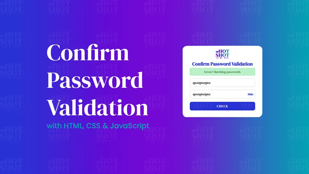
Creating a confirm password checker is essential in web development for validating user inputs, especially when passwords are involved. In this tutorial, we’ll walk through a project that uses HTML, CSS, and JavaScript to create a password confirmation form that provides a smooth user experience. We’ll explain how each piece of code works to build a dynamic form that enables password visibility toggling and error messaging when passwords do not match.
Introduction
In this post, we’ll create a “Confirm Password” form where users enter a password and confirm it in a second field. The form checks if the passwords match, and includes features like:
- Enabling and disabling fields based on input
- Displaying error or success messages
- A “Show/Hide” password toggle
This guide is aimed at beginner and intermediate developers who want to enhance their understanding of form validation with JavaScript.
HTML Structure
The HTML portion of our code sets up the structure of the form. Here’s a breakdown of each part:
					<!DOCTYPE html>
<!-- Created By Mr.Geek - www.WPHotShot.com -->
<html lang="en" dir="ltr">

<head>
  <meta charset="utf-8">
  <title>Confirm Password Validation | WPHotShot</title>
  <link rel="stylesheet" href="style.css">
</head>

<body>
  <div class="container">
    <img decoding="async" class="logo" src="img/main-logo-1.png" alt="">
    <header>Confirm Password Validation</header>
    <form action="#">
      <div class="error-text"></div>
      <div class="field">
        <input onkeyup="active()" id="pswrd_1" type="password" placeholder="Enter Password">
      </div>
      <div class="field">
        <input onkeyup="active_2()" id="pswrd_2" disabled type="password" placeholder="Confirm Password">
        <div class="show">
          SHOW
        </div>
      </div>
      <button disabled>Check</button>
    </form>
  </div>


  <script type="text/JavaScript" src="script.js"></script>
</body>

</html>
Key HTML Elements
- Container Div: Wraps the entire form and header.
- Header: Title for the form to give users context.
- Form Element: Contains the fields for password entry and confirmation.
- Input Fields:
#pswrd_1: Where users enter their initial password.#pswrd_2: Where users confirm the password; initially disabled until a valid password is entered inpswrd_1.
- Error Text Div: Displays error messages if passwords don’t match.
- Show Button: Allows users to toggle password visibility.
- Check Button: Checks if the passwords match when clicked.
CSS Styling
To style our form, a simple CSS file (style.css) is used. This can include settings for alignment, colors, and button states, which you can customize based on your theme.
					@import url('https://fonts.googleapis.com/css2?family=DM+Serif+Display:ital@0;1&family=Outfit:wght@100..900&display=swap');

* {
  margin: 0;
  padding: 0;
  box-sizing: border-box;
  font-family: "DM Serif Display", serif;
}

html,
body {
  display: grid;
  height: 100%;
  place-items: center;
  text-align: center;
  background: #f2f2f2;
  background-image: url("img/watermark_BG.png");
}

.logo{
  width: 70px;
  height: auto;
}

.container {
  background: #fff;
  padding: 20px 30px;
  width: 420px;
  border-radius: 20px;
  box-shadow: 0 0 15px rgba(0, 0, 0, 0.2);
}

header{
  color: #2832D4;
}

.container header {
  padding-top: 5px;
  font-size: 25px;
  font-weight: 600;
  line-height: 33px;
}

.container form {
  margin: 5px 8px;
}

.container form .error-text {
  background: #ebc3c7;
  padding: 8px 0;
  border-radius: 5px;
  color: #813039;
  border: 1px solid #e0a6ac;
  display: none;
}

.container form .error-text.matched {
  background: #baf0c7;
  color: #378148;
  border-color: #9fe2ae;
}

.container form .field {
  width: 100%;
  height: 45px;
  display: flex;
  margin: 15px 0;
  position: relative;
}

form .field input {
  width: 100%;
  height: 100%;
  border: 1px solid lightgrey;
  padding-left: 15px;
  outline: none;
  border-radius: 10px;
  font-size: 17px;
  transition: all 0.3s;
}

form .field input::placeholder {
  font-size: 16px;
}

form .field input:focus {
  border-color: #2832D4;
  box-shadow: inset 0 0 3px #2fd072;
}

form .field .show {
  position: absolute;
  right: 10px;
  top: 50%;
  transform: translateY(-50%);
  font-size: 14px;
  font-weight: 600;
  user-select: none;
  cursor: pointer;
  display: none;
}

form .field .show.active {
  color: #2832D4;
}

form button {
  width: 100%;
  height: 45px;
  margin: 3px 0 10px 0;
  border: none;
  outline: none;
  background: #2832D4;
  border-radius: 10px;
  color: #fff;
  font-size: 18px;
  font-weight: 500;
  letter-spacing: 1px;
  text-transform: uppercase;
  cursor: no-drop;
  opacity: 0.7;
}

form button.active {
  cursor: pointer;
  opacity: 1;
  transition: all 0.3s;
}

form button.active:hover {
  background: #7209D4;
}
JavaScript Logic for Password Confirmation
The JavaScript code is where the primary functionality is implemented. Here’s an overview:
					const pswrd_1 = document.querySelector("#pswrd_1");
const pswrd_2 = document.querySelector("#pswrd_2");
const errorText = document.querySelector(".error-text");
const showBtn = document.querySelector(".show");
const btn = document.querySelector("button");
function active() {
  if (pswrd_1.value.length >= 6) {
    btn.removeAttribute("disabled", "");
    btn.classList.add("active");
    pswrd_2.removeAttribute("disabled", "");
  } else {
    btn.setAttribute("disabled", "");
    btn.classList.remove("active");
    pswrd_2.setAttribute("disabled", "");
  }
}
btn.onclick = function () {
  if (pswrd_1.value != pswrd_2.value) {
    errorText.style.display = "block";
    errorText.classList.remove("matched");
    errorText.textContent = "Passwords do not match";
    return false;
  } else {
    errorText.style.display = "block";
    errorText.classList.add("matched");
    errorText.textContent = "Great! Passwords match";
    return false;
  }
}
function active_2() {
  if (pswrd_2.value != "") {
    showBtn.style.display = "block";
    showBtn.onclick = function () {
      if ((pswrd_1.type == "password") && (pswrd_2.type == "password")) {
        pswrd_1.type = "text";
        pswrd_2.type = "text";
        this.textContent = "Hide";
        this.classList.add("active");
      } else {
        pswrd_1.type = "password";
        pswrd_2.type = "password";
        this.textContent = "Show";
        this.classList.remove("active");
      }
    }
  } else {
    showBtn.style.display = "none";
  }
}
Step-by-Step Code Explanation
Let’s walk through the main JavaScript functions and event listeners that make this password confirmation form dynamic.
Function 1: active()
This function is triggered when users type in the first password field, pswrd_1. It checks the length of the password and enables the confirm password field (pswrd_2) and the “Check” button if the length is at least 6 characters.
function active() {
  if (pswrd_1.value.length >= 6) {
    btn.removeAttribute("disabled", "");
    btn.classList.add("active");
    pswrd_2.removeAttribute("disabled", "");
  } else {
    btn.setAttribute("disabled", "");
    btn.classList.remove("active");
    pswrd_2.setAttribute("disabled", "");
  }
}
- Check Password Length: Passwords need to be at least 6 characters.
- Enable/Disable Fields: If the criteria are met, the confirm password field and button are enabled.
Function 2: Button Click Event (Password Match Check)
This event checks if the two passwords match when the “Check” button is clicked. If they match, a success message is displayed; otherwise, an error message is shown.
- Password Match Check: Compares
pswrd_1andpswrd_2values. - Error Handling: Displays “Error! Confirm Password Not Match” if they don’t match.
- Success Handling: Displays “Nice! Confirm Password Matched” if they match.
Function 3: active_2() and Show Button Toggle
The active_2() function enables the visibility toggle button if the confirm password field is not empty.
- Display Show Button: The button becomes visible once the confirm password field has content.
- Toggle Password Visibility: Converts the password fields to plain text and back to “password” based on user input. The button text changes from “Show” to “Hide” and vice versa.
Demo:
Conclusion
This password confirmation form is a simple, yet effective way to enhance form usability with real-time validation and feedback. By using JavaScript for logic, CSS for styling, and HTML for structure, we created an interactive form that checks for password match and includes additional features like a “Show/Hide” toggle. With a few tweaks, you can further customize this code to suit your website’s style and requirements.


