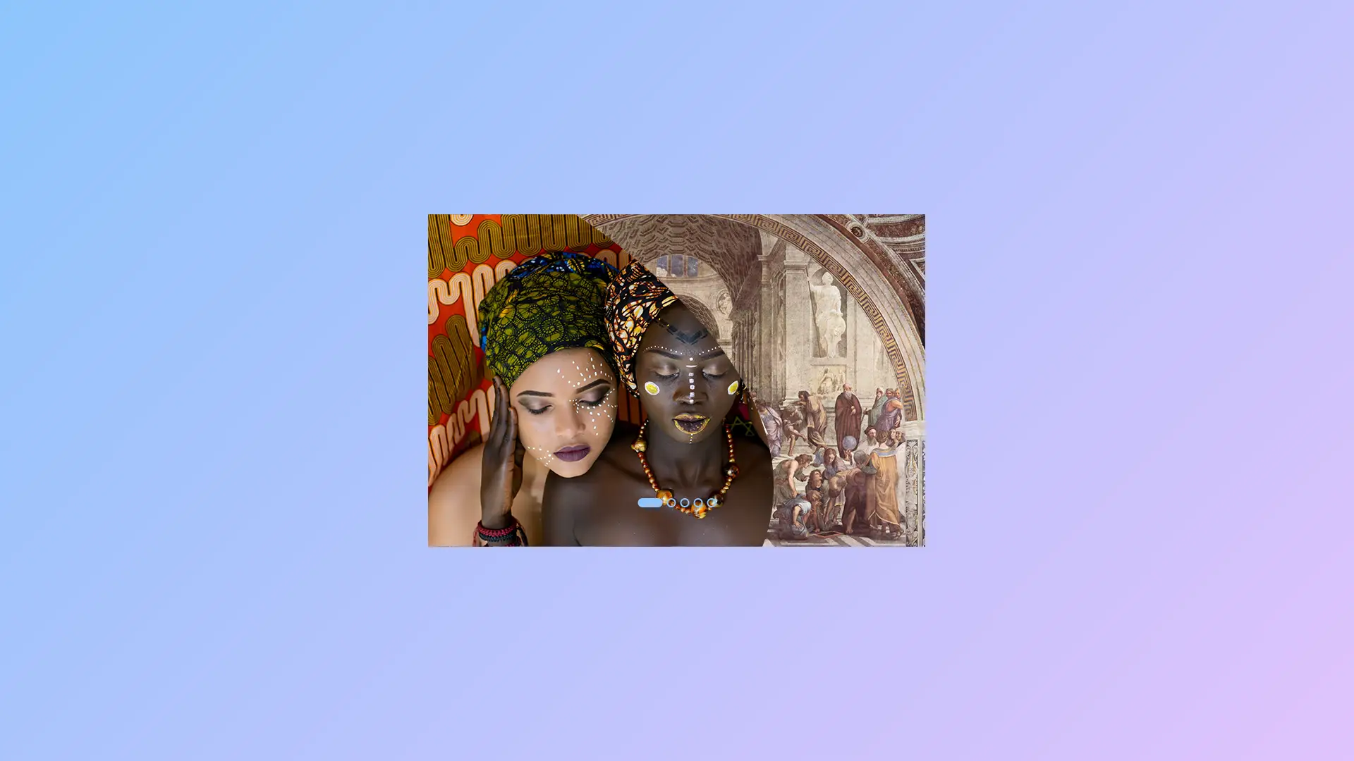
In creation of Image Clip Animation Slider, HTML (Hypertext Markup Language) and CSS (Cascading Style Sheets) are two fundamental technologies are used. HTML is used to structure the content of a web page, while CSS is used to add style and layout to the content. When combined, HTML and CSS provide a powerful tool for creating dynamic and engaging web pages.
One of the most popular design elements on modern websites is the image slider. Image sliders are typically used to display a series of images on a web page and provide a means of navigation between the images. With the use of HTML and CSS, developers can create advanced image sliders with unique animations and effects. In this article, we will focus on image clip animation sliders and explore how to create these sliders using HTML and CSS.
HTML for Image Clip Animation Sliders
HTML is the backbone of any web page, and it is the structure that provides the foundation for the content. To create an image slider using HTML, you will need to create a container element to hold the images, and then create individual elements for each image that you want to include in the slider. The container element can be any HTML element such as a div, section, or article.
To create this program (Image Clip Animation with Sliders). First, you need to create two Files one HTML File and another one is CSS File. After creating these files just paste the following codes into your file.
First, create an HTML file with the name of index.html and paste the given codes in your HTML file. Remember, you will have to create a file with .html extension and the images that you will use on this Clip Animation, otherwise images won’t appear.
					<!DOCTYPE html>
<!-- Created By Mr. Geek - www.WPHotShot.com -->
<html lang="en" dir="ltr">
  <head>
    <meta charset="utf-8">
    <title>Image Clip Animation | WPHotShot</title>
    <link rel="stylesheet" href="style.css">
  </head>
  <body>
    <div class="wrapper">
      <input type="radio" name="slide" id="one" checked>
      <input type="radio" name="slide" id="two">
      <input type="radio" name="slide" id="three">
      <input type="radio" name="slide" id="four">
      <input type="radio" name="slide" id="five">
      <div class="img img-1">
        <img decoding="async" src="images/img-1.jpg" alt="">
      </div>
      <div class="img img-2">
        <img decoding="async" src="images/img-2.jpg" alt="">
      </div>
      <div class="img img-3">
        <img decoding="async" src="images/img-3.jpg" alt="">
      </div>
      <div class="img img-4">
        <img decoding="async" src="images/img-4.jpg" alt="">
      </div>
      <div class="img img-5">
        <img decoding="async" src="images/img-5.jpg" alt="">
      </div>
      <div class="sliders">
        <label for="one" class="one"></label>
        <label for="two" class="two"></label>
        <label for="three" class="three"></label>
        <label for="four" class="four"></label>
        <label for="five" class="five"></label>
      </div>
    </div>

  </body>
</html>
CSS for Image Clip Animation Sliders
CSS is used to add style and layout to the content of a web page. When creating an image slider, CSS is used to control the appearance of the slider, including the animation and transition effects. To create a clip animation slider, you will need to use CSS to hide the images that are not currently being displayed and to show the current image with a specific animation effect.
Second, create a CSS file with the name of style.css and paste the given codes in your CSS file. Remember, you’ve to create a file with .css extension.
					*{
  margin: 0;
  padding: 0;
  box-sizing: border-box;
}
body{
  min-height: 100vh;
  display: flex;
  align-items: center;
  justify-content: center;
  background: -webkit-linear-gradient(136deg, rgb(224,195,252) 0%, rgb(142,197,252) 100%);
}
.wrapper{
  position: relative;
  width: 700px;
  height: 400px;
}
.wrapper .img{
  position: absolute;
  width: 100%;
  height: 100%;
}
.wrapper .img img{
  height: 100%;
  width: 100%;
  object-fit: cover;
  clip-path: circle(0% at 0% 100%);
  transition: all 0.7s;
}
#one:checked ~ .img-1 img{
  clip-path: circle(150% at 0% 100%);
}
#two:checked ~ .img-1 img,
#two:checked ~ .img-2 img{
  clip-path: circle(150% at 0% 100%);
}
#three:checked ~ .img-1 img,
#three:checked ~ .img-2 img,
#three:checked ~ .img-3 img{
  clip-path: circle(150% at 0% 100%);
}
#four:checked ~ .img-1 img,
#four:checked ~ .img-2 img,
#four:checked ~ .img-3 img,
#four:checked ~ .img-4 img{
  clip-path: circle(150% at 0% 100%);
}
#five:checked ~ .img-1 img,
#five:checked ~ .img-2 img,
#five:checked ~ .img-3 img,
#five:checked ~ .img-4 img,
#five:checked ~ .img-5 img{
  clip-path: circle(150% at 0% 100%);
}
.wrapper .sliders{
  position: absolute;
  bottom: 20px;
  left: 50%;
  transform: translateX(-50%);
  z-index: 99;
  display: flex;
}
.wrapper .sliders label{
  border: 2px solid rgb(142,197,252);
  width: 13px;
  height: 13px;
  margin: 0 3px;
  border-radius: 50%;
  cursor: pointer;
  transition: all 0.3s ease;
}
#one:checked ~ .sliders label.one,
#two:checked ~ .sliders label.two,
#three:checked ~ .sliders label.three,
#four:checked ~ .sliders label.four,
#five:checked ~ .sliders label.five{
  width: 35px;
  border-radius: 14px;
  background: rgb(142,197,252);
}
.sliders label:hover{
  background: rgb(142,197,252);
}
input[type="radio"]{
  display: none;
}
That’s all, now you’ve successfully created an Image Clip Animation with Sliders using only HTML & CSS. If your code does not work or you’ve faced any error/problem please feel free to contact us.
Find more tutorials regarding Web Development here.


