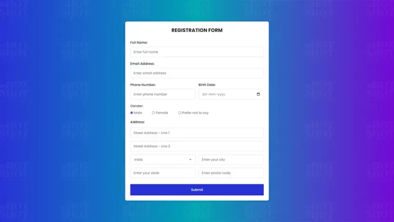
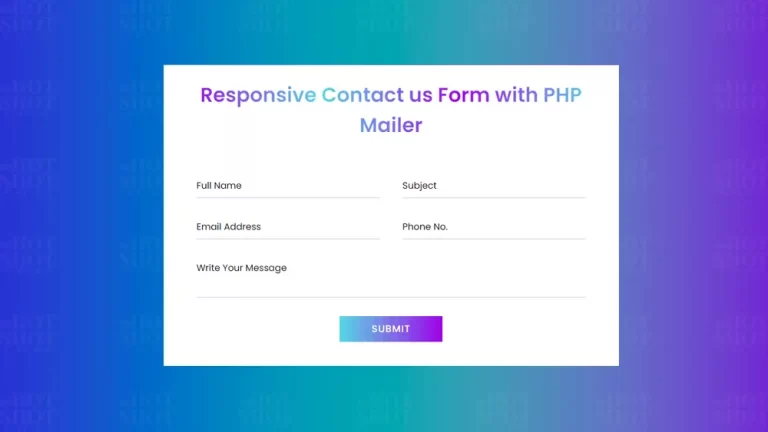
The user experience is a critical aspect of web development, and providing an engaging and intuitive experience can have a significant impact on user retention and conversion rates. One area that is particularly important in this regard is web forms, which are often essential for gathering user data or facilitating transactions. However, poorly designed or difficult to use forms can be frustrating for users and lead to abandoned forms or low completion rates.
One way to improve the usability and visual appeal of web forms is to use input box animation. By adding animation to form fields, you can provide users with visual feedback and make the form more engaging and intuitive. In this article, we will explore how to create input box animation using only HTML and CSS and examine the benefits of this approach for web forms.
The Basics of Input Box Animation
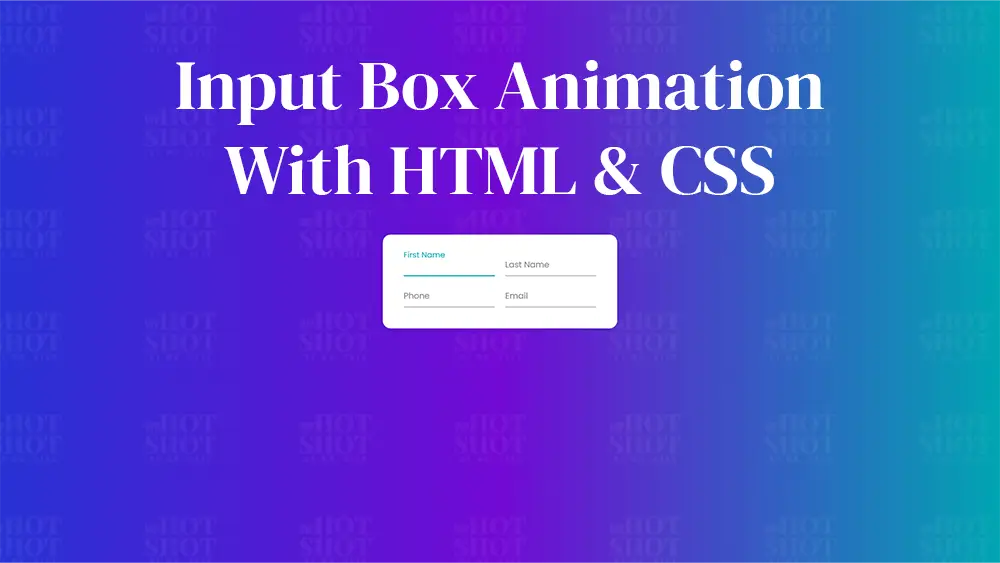
Input box animation refers to the visual effects that are applied to form fields to provide feedback to users. Typically, this involves adding a label or placeholder inside the input field that animates when the user interacts with the field. For example, the label might move above the input field, change color, or shrink in size when the user clicks on the field or starts typing.
There are several benefits to using input box animation in web forms. Firstly, it can make the form more visually appealing and engaging, which can help to reduce user frustration and encourage completion. Secondly, it can provide users with visual feedback that helps them to understand what they need to enter into the form field, reducing errors and improving completion rates. Finally, it can make the form more accessible for users with disabilities, as the animation can provide additional cues to assistive technologies such as screen readers.
Creating Input Box Animation Using HTML and CSS
Now let’s take a look at how to create input box animation using only HTML and CSS. The following code snippets demonstrate a simple approach for adding animation to a form field:
HTML Code:
To create Input Box Animation, create an HTML file with the name of index.html and paste the given codes in your HTML file. Remember, you’ve to create a file with .html extension.
					<!DOCTYPE html>
<!-- Created By Mr. Geek, www.wphotshot.com -->
<html lang="en" dir="ltr">

<head>
  <meta charset="utf-8">
  <title>Input Animation | WPHotShot</title>
  <link rel="stylesheet" href="style.css">
</head>

<body>
  <div class="container wrapper">
    <div class="sub-container">
      <div class="wrapper-1">
        <div class="input-data">
          <input type="text" required>
          <div class="underline"></div>
          <label>First Name</label>
        </div>
        <div class="input-data">
          <input type="text" required>
          <div class="underline"></div>
          <label>Last Name</label>
        </div>
      </div>
    </div>
    <div class="sub-container">
      <div class="wrapper-1">
        <div class="input-data">
          <input type="text" required>
          <div class="underline"></div>
          <label>Phone</label>
        </div>
        <div class="input-data">
          <input type="text" required>
          <div class="underline"></div>
          <label>Email</label>
        </div>
      </div>
    </div>
  </div>
</body>

</html>
Now that we have created HTML file, now lets create our second file.
CSSS Code:
Second, create a CSS file with the name of style.css and paste the given codes in your CSS file. Remember, you’ve to create a file with .css extension.
					@import url('https://fonts.googleapis.com/css?family=Poppins:400,500,600,700&display=swap');
*{
  margin: 0;
  padding: 0;
  outline: none;
  box-sizing: border-box;
  font-family: 'Poppins', sans-serif;
}
body{
  display: flex;
  align-items: center;
  justify-content: center;
  min-height: 100vh;
  background: linear-gradient(90deg, #2832d4, #7209d4, #00a5b2);
}
.wrapper{
  width: 450px;
  background: #fff;
  padding: 30px;
  box-shadow: 0px 0px 10px rgba(0,0,0,0.1);
  border-radius: 15px;

}
.wrapper .input-data{
  height: 40px;
  width: 100%;
  position: relative;
}
.wrapper .input-data input{
  height: 100%;
  width: 100%;
  border: none;
  font-size: 17px;
  border-bottom: 2px solid silver;
}
.input-data input:focus ~ label,
.input-data input:valid ~ label{
  transform: translateY(-20px);
  font-size: 15px;
  color: #00a5b2;
}
.wrapper .input-data label{
  position: absolute;
  bottom: 10px;
  left: 0;
  color: grey;
  pointer-events: none;
  transition: all 0.3s ease;
}
.input-data .underline{
  position: absolute;
  height: 2px;
  width: 100%;
  bottom: 0;
}
.input-data .underline:before{
  position: absolute;
  content: "";
  height: 100%;
  width: 100%;
  background: #00a5b2;
  transform: scaleX(0);
  transform-origin: center;
  transition: transform 0.3s ease;
}
.input-data input:focus ~ .underline:before,
.input-data input:valid ~ .underline:before{
  transform: scaleX(1);
}

.input-data{
  margin: 10px;
}

.wrapper-1{
  display: flex;
}
In the CSS code, we have styled the input box with a border, font size, and padding. We have also added a transition effect for the border color and box shadow when the input box is in focus. The label’s font size and color will change when the user starts typing, and the label will transition to float above the input box.
Adding input box animation is an excellent way to enhance the usability of web forms, providing visual feedback that helps users understand what they need to enter. It’s also an excellent opportunity to add some creative flair to your website, making it more engaging and interactive for users.
In conclusion, input box animation using only HTML and CSS is a simple yet effective way to improve the user experience of web forms. By adding this technique to your website, you can engage your users and provide visual feedback that enhances usability. It’s easy to implement, requires no external libraries, and can help take your website to the next level.

